Welcome to the EGGhead Forum - a great place to visit and packed with tips and EGGspert advice! You can also join the conversation and get more information and amazing kamado recipes by following Big Green Egg to Experience our World of Flavor™ at:
Want to see how the EGG is made? Click to Watch
Facebook | Twitter | Instagram | Pinterest | Youtube | Vimeo
Share your photos by tagging us and using the hashtag #BigGreenEgg.
Share your photos by tagging us and using the hashtag #BigGreenEgg.
Want to see how the EGG is made? Click to Watch
OT: Food Photography Competition, Help me pick.
Options

Boilermaker Ben
Posts: 1,956
Hi gang,
I'm entering a cooking/photography competition run by a world-renowned chef and a professional food photographer, and I can only select ONE photo to submit. I'm having a hard time picking only one. The photos will be judged on the following criteria: Is the food beautiful? Is the photograph beautiful? And, most importantly, does the photograph make you want to try the food?
I figured that the wonderful cooks and photographers here at the forum could help me pick the best photo. Let me know what you think.
Candidate 1

Candidate 2
Candidate 3

Candidate 4

Candidate 5

Candidate 6

Candidate 7

Candidate 8

Candidate 9

How this is different from photo 8:
The tacos are facing another direction. There is no empty space in the back of the taco platter. The flowers are more in focus, however, the vase is facing a different direction. More of the watermelon salad bowl can be seen. More of the background wall is visible. The shrimp ceviche in photo 8 is brighter and in better focus.
Candidate 10

Thanks for your help.
Ben
I'm entering a cooking/photography competition run by a world-renowned chef and a professional food photographer, and I can only select ONE photo to submit. I'm having a hard time picking only one. The photos will be judged on the following criteria: Is the food beautiful? Is the photograph beautiful? And, most importantly, does the photograph make you want to try the food?
I figured that the wonderful cooks and photographers here at the forum could help me pick the best photo. Let me know what you think.
Candidate 1
Candidate 2
Candidate 3
Candidate 4
Candidate 5
Candidate 6
Candidate 7
Candidate 8
Candidate 9
How this is different from photo 8:
The tacos are facing another direction. There is no empty space in the back of the taco platter. The flowers are more in focus, however, the vase is facing a different direction. More of the watermelon salad bowl can be seen. More of the background wall is visible. The shrimp ceviche in photo 8 is brighter and in better focus.
Candidate 10
Thanks for your help.
Ben
Comments
-
My vote is for #8
-
I like 8 as well.
Has great image flow.
Now I have to go and find breakfast.
Guess we are both hungry.
darianThank you,DarianGalveston Texas -
The one that works best for me, in so far as it makes me want to eat the food is No. 5. I can see what is being made, what the results look like, and what the ingredients are. The sauce running off the spoon is an eye grabber. However, the color balance is not as good as many of the other photos.
The problem I have with a lot of the photos is that I don't quite know what I'm looking at. What is the focus? No. 8 looks like a really nice spread, but there is no one thing to center in on.
Likewise, no. 1 works pretty well, but I don't exactly know what I'm looking. I don't do many mixed drinks, and I don't see what the components make.
No. 7 has lots of nice bright shapes, crisp detail and bright color. From an abstract view, it works pretty well. The top could be cropped of a bit maybe. But once again, from a food perspective, nothing stands out as the essential topical element. -
-
Ben - My take! 1-3 don't do much for me. 4-6: I love 5 as it shows action, target food, makes me want to grab that morsel and eat it. I like 4 more than 6. #7 has to much background and it is distracting. 8-10: 8 has best balance, better cropping, contrast, angle, color, and I like the framing better. 9 has to much background and it is distracting. 10 has a less interesting angle. Tough call overall between 5 and 8 but I like the action and subject focus of 5 better - meets the "want to eat" part of the contest best of your candidates. Good Luck!
-
#8 looks mighty gooood to me.
Bob
Alex City, AlOpelika, Alabama -
") IMHO I think that shot #7 is the best
IMHO I think that shot #7 is the best
I liked all the shots and now I'm hungry -
These pics are beautiful but I think you should consider some cropping. I am a photographer by trade. If you want to email me, I can give you an example of what I am talking about. You have some great shots to work with here.
Bob Trudnak
bbqbob@thebbqguru.com -
i like them all, too, but i think 7 is strongest.
my pics here are nothing to shout about, but in my day job i do a little artwork. i find that simple is usually best.
keep in mind that they will have a few hundred, maybe a thousand or more, of these to go through. they will flash on a screen during a few rounds of review probably. first time through they will get a thumbs-up or thumbs-down with only maybe a second or two on screen.
i think you want a strong composition and color, clear subject. for me, 7 does that. I might crop it a bit at the top and left, but that's me being art-boy. hahaha
i like 8 as well, but just not sure what the center of interest is. where does the eye land first and keep coming back? 7 seems to do that
anyway, they are frankly all pretty well considered, and i would be happy if my food pics were in the same league.ed egli avea del cul fatto trombetta -Dante -
I liked the overall theme, along with the use of natural lighting. I think the colors, the background, lighting and depth of field in #7 is great.
I too think the flowers in the glasses are a distraction. In 4, 5 & 6, the lack of a serving plate caught my attention before anything else.
My pick is #2. Looking at that photograph, I understand exactly what was going on, and it made me want to reach right in and go to work. The lighting, colors, and sharpness were spot on. The crop broke up the shapes of ordinary things and forced me to use a little imagination.....That picture made me return for a second and third look.Happy Trails~thirdeye~Barbecue is not rocket surgery -
i liked #2 because of the tight crop and lighting, but i really wanted that glass to be full! hahahaed egli avea del cul fatto trombetta -Dante
-
Thanks for the comments so far, everyone.
Stike, surprisingly, there haven't been that many entrants in previous competitions. The biggest turnout so far has been 20 entrants. I've seen the winning photos from the previous three competitions, and I feel like I definitely have a shot. Unfortunately, unlike the previous three rounds which had three winners each, this one will only have one winner. -
Right on....it made you want something. In judging, the judge won't have the benefit of seeing the first picture with the tequila, or the others with the Mexican food. He or she will know it's the makings for a drink (a margarita, mojito, a mimosa, or maybe just a round of screwdrivers and greyhounds) and their brain will have to connect the dots... and maybe believe it's their favorite drink.Happy Trails~thirdeye~Barbecue is not rocket surgery
-
good luck. sounds like you have good odds.
if they ARE lingering on the photos, it will help. every year i enter an illustration contest, and i know that the judges weed through about 500 images in two day's time. the first round they just rip right through yes, no, yes, no.
they are all good. i say go with your gut. pick whichever one you feel best about
do you have photoshop at all? you could do some very simple post work to bump things a bit. cropping and adjusting levels. finding a little color where it might be hiding (literally) in the shadows. etc.
all good though.ed egli avea del cul fatto trombetta -Dante -
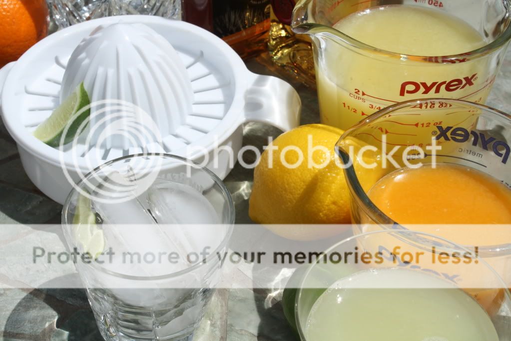
Menu/recipes for the competition were provided. So presumably everyone will have prepared the same dishes, and the judging panel will know the dishes/recipes. In which case, the judges might be able to figure out that the juices in photos 1 and 2 are NOT actually all in the cocktail.
I juiced all those citrus early in the day, and got so carried away with how nicely they looked together, that I forgot that they didn't ALL go into the cocktail. The cocktail recipe was actually lemon juice and guava juice (which came from a can, and didn't make it into the photo) plus agave nectar and tequila. The orange and lime juices were for other recipes. While I like the photo, I don't know if that might come into consideration in the judging.
Also, I have the opportunity to post an additional two photos for posterity (and for the other participants and random people who stop by the blog to drool over). Only the submitted photo will be judged, however. -
Put me in the #7 camp - but I would crop out the top where you have the band of sunlight across the grass.
Bump the saturation a little and your colors will really pop. -
Candidate 8..........
-
Thanks, Fidel. I've gotten a few suggestions for cropping. I've asked the competition administrators if standard dimensions (e.g. 4x6) are required. I also noticed that in the previous competitions, all the photos were landscape layout. I'm waiting to hear if profile layout, like number 7 is acceptable.
-
I don't have photoshop. I've got the Canon photo editing software that came with my DSLR, and I recently downloaded the freeware paint.net, but haven't played with it much yet. My photo-editing experience is pretty much limited to cropping and removing red-eye.
-
I like #6
All look nice.
Seth -
Not read the other responses. I think #5 best meets all of the requirements you mentioned. I think #7 is a better photograph, but # 5 makes me want to eat the food more. Who put those flowers in my glasses anyways?
Good luck!!
Nice shots
Chris -
Those are really good points. Most lack a defined focal point and dynamics, but are nicely balanced, colorful and well composed. I think that's where #5 comes in....it has some dynamics as well as a defined focal point. Wish the hand and spoon came in at an angle.
Cheers
Chris -
Ben...
I like # 6...but #8 is also in the runnning...
good luck! -
You have some nice pictures.
The background and far background is way to busy and one's eye gravitates to those areas for a time than back to the subject.
I like number #2 but it is cropped to tightly and too busy.
When you are using the flowers in glasses there are too many and they are positioned directly behind other subjects of interest. Some even look like they are part of the foreground subject. Reduce or remove and let the color be the in the food.
To me the most interesting and pretty is #5. Use a longer spoon handle, maybe something like a malt spoon so the hand isn't in the picture. If you must have a hand remove all jewelery and try to find a soft feminine hand.
I also like #7 but again the far background is distracting. The flowers/glasses confuse the shot. I am not sure if I should look at the flowers or the food.
#8, #9 and #10 are very interesting and attractive. They have too much food or possibly food positioning. The flowers/glasses are not as big of a distraction, possibly because they are smaller in appearance. However, with as much food as you are showing they probably should be removed. Again the far backgrounds are distracting. #9 far background, the brick, seems to be demanding attention.
You might find with as much television advertising of Jose Cuervo the #1 shot might be an advantage. In this shot I would remove the picture, orange label Pyrex measuring cup, and possibly whatever the item is inbetween the picture and Cuevo bottle. All the vertical lines in the far background again are distracting to the eye.
A simple clean background/backdrop would be a big help.
If you have to use what is presented above. I like #2, #5 & #7 the best.
Very nice shots there, you have done a good job.
GG -
Beautiful photos Ben!! I love all of them and if I had to pick one it would have to be #5. I had a hard time narrowing it down but #5 & #7 were close. Good luck in the competition and please let us know the outcome.
-
I like candidate 7, for sure.
-
Ocho is the best.
-
") Like 8 and 5
Like 8 and 5
Let us know which one you choose, please. -
To me the most interesting and pretty is #5. Use a longer spoon handle, maybe something like a malt spoon so the hand isn't in the picture. If you must have a hand remove all jewelery and try to find a soft feminine hand.
The masculine hand and no plate makes #5 a "real life" shot! And the sauce flowing off the spoon comes to life.
It's not a "Pretty, composed" picture but the composition is real--just like everyday life--kinda nuevo Norman Rockwell :cheer: -
#7.
Best focus throughout the pic. There's not too much going on in it. Simple and tasty.
Like 8, but the focus is a bit soft, some DOF issues, to me.


Categories
- All Categories
- 182.7K EggHead Forum
- 15.7K Forum List
- 459 EGGtoberfest
- 1.9K Forum Feedback
- 10.3K Off Topic
- 2.2K EGG Table Forum
- 1 Rules & Disclaimer
- 9K Cookbook
- 12 Valentines Day
- 91 Holiday Recipes
- 223 Appetizers
- 516 Baking
- 2.4K Beef
- 88 Desserts
- 163 Lamb
- 2.4K Pork
- 1.5K Poultry
- 30 Salads and Dressings
- 320 Sauces, Rubs, Marinades
- 543 Seafood
- 175 Sides
- 121 Soups, Stews, Chilis
- 35 Vegetarian
- 100 Vegetables
- 313 Health
- 293 Weight Loss Forum